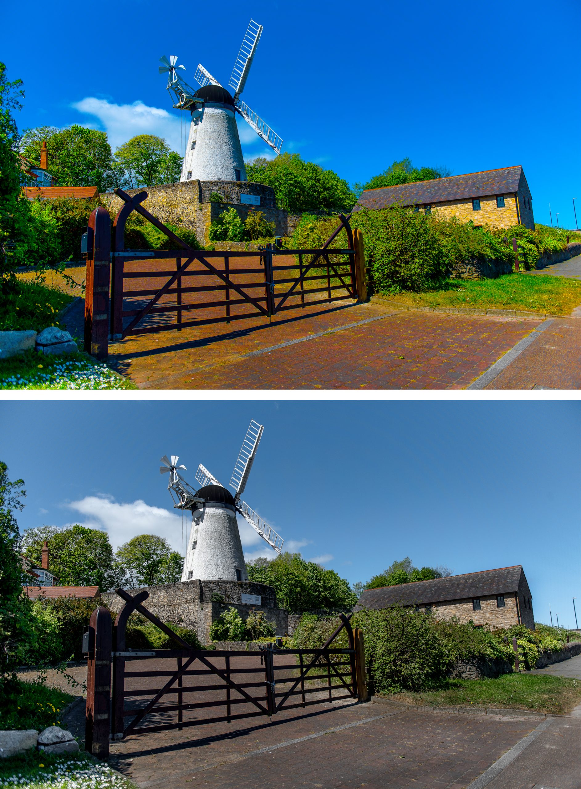
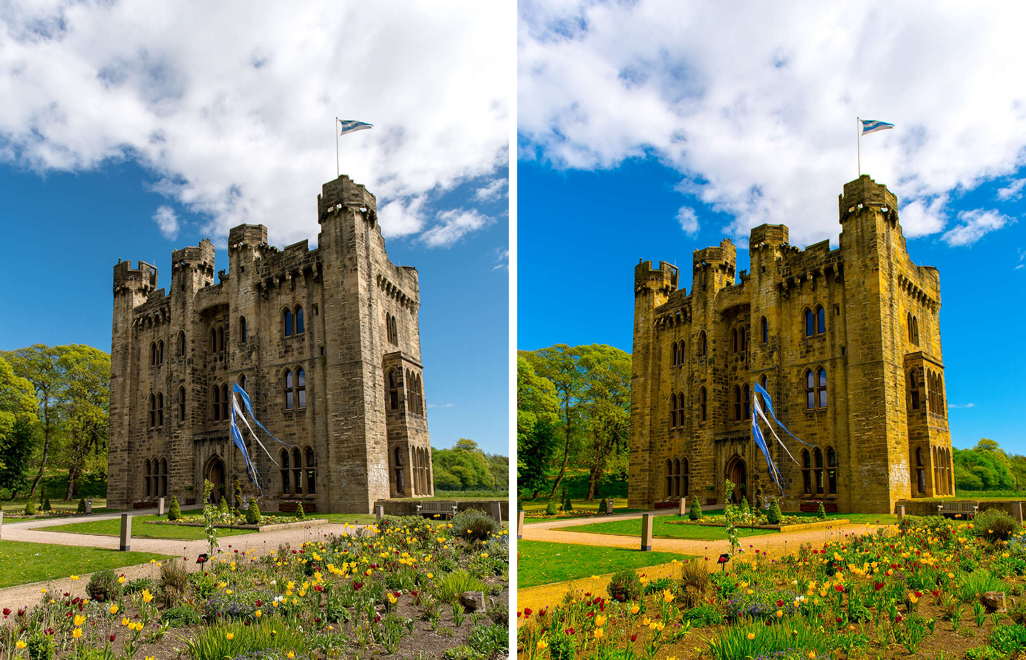
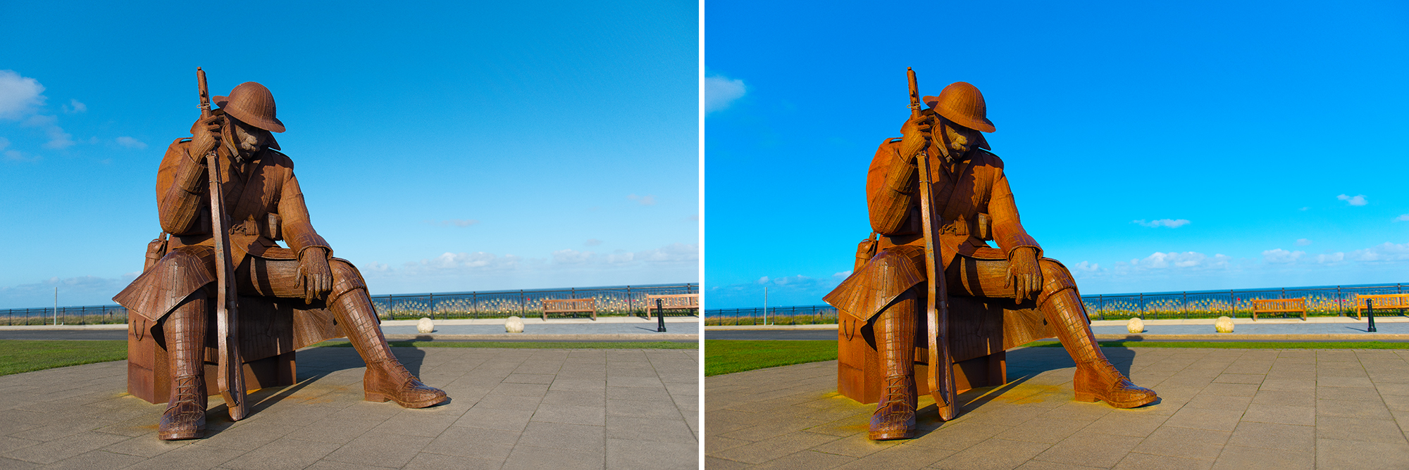
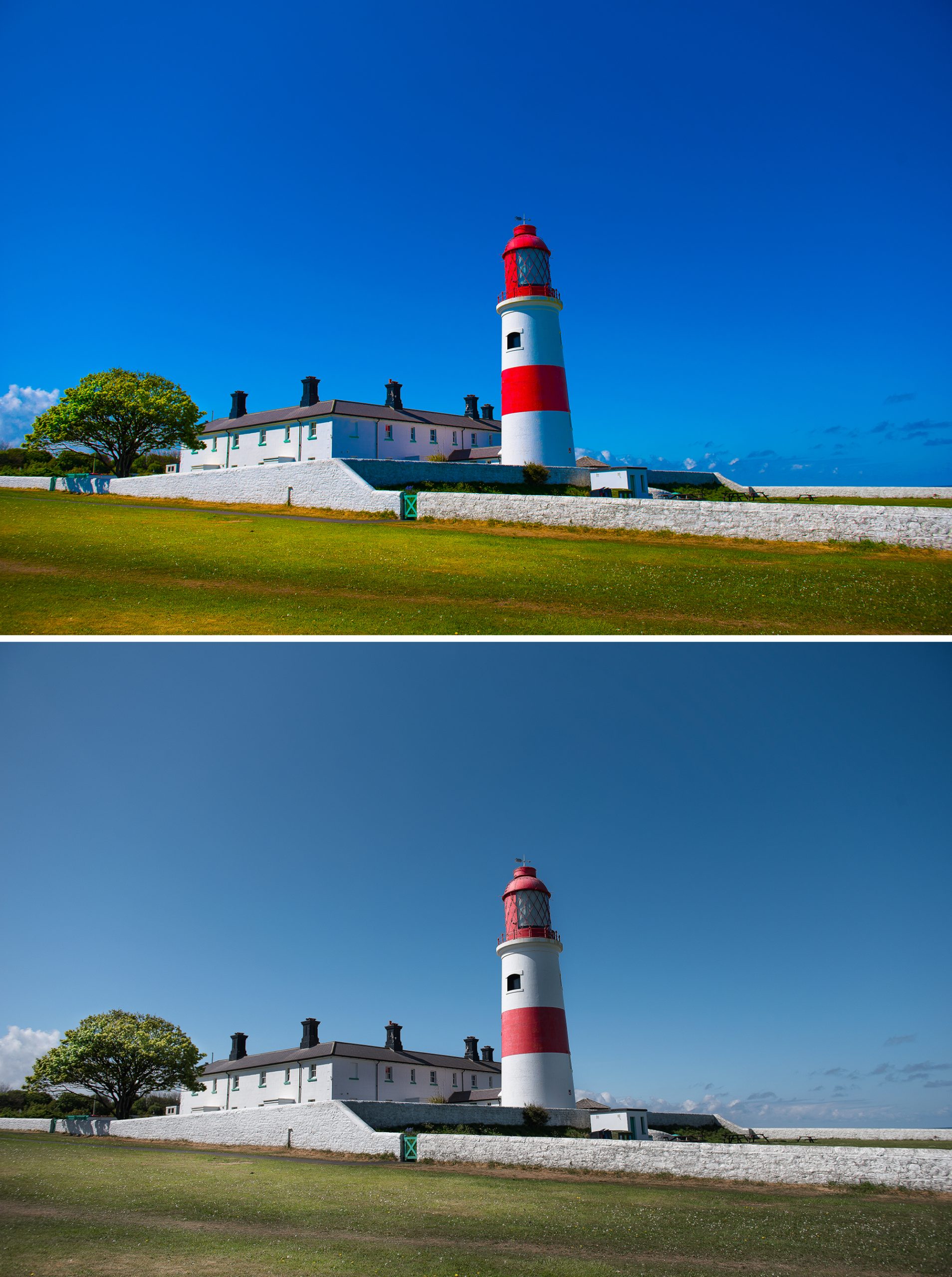
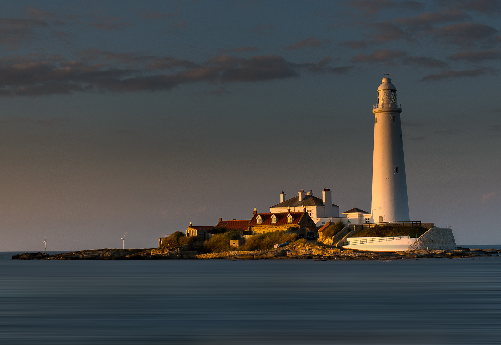
Oversaturation can destroy your photograph’s visual impact and trust of the viewer so resist boosting the colours and bring some reality back into your shots…
Insatiable Appetite For Bright Colour
Let’s set the scene; You’ve just captured a stunning sunset and the colours are glowing brightly on your camera screen. You crank up the saturation slider in your chosen editing software and boom!, before you know it, the sky is bursting with fiery reds and the oranges are glowing like an F1 McLaren at full pelt. It almost looks alive, right? That colour pop draws you in quicker than a fortune teller on Blackpool seafront, but take a breath and… reflect.
As the first hit of vivid hues trigger an endorphin surge, your oversaturation buzz might feel good but, over time, the very ‘enhanced’ brights can turn the viewer off. They sense something isn’t quite as it should be.
Our eyes expect balance, not overload. Studies from colour psychology back this. Like it or not, subconsciously we trust images that match real life, while ‘fake vibrancy’ disconnects integrity and trust.
Defining Oversaturation
Oversaturation happens when you boost colour channels beyond what can be deemed as natural; think of it as maxing out those tempting blue, red or green sliders. This means when viewed on a screen, colours have hit their peak with a harsh look and no smooth blending. In simple terms, it’s like shouting when a whisper would be suffice.
Reality Vs Cartoon
Excess colour can propel your great image straight into cartoon land with viewers questioning its very truth while a less saturated ‘real’ look can build trust via tones that look and feel honest. The story behind the shot can get lost in the noise around it.
Colour Clipping and Loss of Dynamic Range
Push colours way too hard and they ‘clip’. Reds turn solid without gradients and blues lose their subtle shifts. Your photo will flatten out as it loses dynamic range with details almost vanishing within those clipped areas. Imagine a flower petal that should gently fade from pink to white. The nuance isn’t there and becomes almost like LEGO blocks of colour. Viewers see it, even if they can’t explain why.
The Psychedelic Effect
Too much saturation creates a wild, unreal vibe. It’s like playing the lead role in a bad acid trip. Landscape greenery screams rather than soothes the eye. Portraits don’t escape either with skin looking almost like plastic and eyes way too neon.
Hopefully, you try and plan your shot with care. Leading lines and the subject or hero standing out. Crank up that saturation either in the settings of the camera or post editing and it all crumbles. Colours fight for attention, visual flow breaks and the photo turns can into an absolute over excited mess. Focus shifts from the story to spectacle.
Use Subtle Shifts
Subtle shifts can make photos sing with skin tones blending warm to cool. Warm suns with cool skies create peace While clouds hold soft shadows. Saturation flattens everything and mid-tones become muddy. Like a band where all instruments are too overpowering and sound at once. Let colours support, not steal the picture story you created.
Smartphones
It’s also worth remembering while smartphones have come on in leaps and bounds with some great technology, they render and shoot saturation differently than laptops. Check your shots on multiple screens if possible.
Heavy saturation dates your work rapidly much like a 2010s Instagram post but tasteful and subtle editing can last decades – just look at some of the classic National Geographic shots.
Conclusion
Use saturation wisely to highlight, not hide. A subtle touch will enhance depth and what’s already there in the photograph.
Bonus tip: Detail not dazzle – every time!
Behind the Lens